FreeNAS 11.2 new GUI suggestions and discussion thread

Damianos

iXsystems
iXsystems
Joined
Apr 17, 2017
Messages
44
This looks a million times better! I still think it look a bit sloppy to have the graph overlap with the axis labels. :rolleyes:
EDIT1: Also do we NEED the "REPORTS" button? I would rather have the graph use the height than have the "CLICK HERE" feel.And just to nit-pick... Do the graph lines need to be so thick? I feel like there is a 5 year old drawing graphs with a crayon in the background!:D
EDIT2: Also the graph smoothing seems to be adding artifacts to the graph line. Just look at the memory on your screen shot.

EDIT: The REPORTS button is there for efficiency. The dash chart gives a direct link to more in depth information. Also for new users who might not be familiar with the entire UI, we don't want them to have to go look at the sidebar menus, which on smaller screens might also require scrolling, to find the reports page link.

Without getting too much into roadmap stuff that might change, the graph line thickness will make more sense when the reports page is done. We plan on using combination charts and in those scenarios the lines will benefit from being more pronounced. I'd rather have a little bit of thickness on these charts and have them be consistent across the UI.

Also the artifacts you are referring to are not a result of smoothing. It is a known bug we're experiencing with the collectd/rrdtool utility. For some reason the data sent has the last few values come in as undefined which the chart registers as zeros. Also there is never a consistent number of these undefined values so I can't just prune them out. The solution will come from the OS/middleware side.
 
Last edited:

Chewie198

Cadet
Joined
Jan 15, 2014
Messages
8
Long time FreeNAS user here. Just upgraded to the 11.2 Beta and wanted to say that I think you guys did a great job on the new UI. It's much more convenient to have a usable UI on tablets/phones and I really appreciate the work you guys have put in to keep improving the software in general. My wife and I use the product to support a photography business and for personal backup purposes and it's been invaluable in those roles.
 

Alecmascot

Guru
Joined
Mar 18, 2014
Messages
1,177
I have just upgraded my backup server to 11.2-Beta just to see how things are progressing.
As this is a simple setup it is functioning ok, but....

This is the disks display in the old gui:

upload_2018-7-16_15-20-5.png


and this is how it looks in the new gui.....

upload_2018-7-16_15-31-27.png


and this is progress........?
Even with the sidebar collapsed it looks like this :

upload_2018-7-16_15-33-9.png


There is too much white space everywhere, not just on the pages above.
Please tell me this is not how it should look and that I can tweak my browser to make it look better.

If you want to see a really good gui look at that for PFSense.
 

danb35

Hall of Famer
Joined
Aug 16, 2011
Messages
15,504

Alecmascot

Guru
Joined
Mar 18, 2014
Messages
1,177
Ack! Heavens, no--the organization of the pfSense GUI is awful.
Maybe, but the use of space on the screen is far superior.....
 

kdragon75

Wizard
Joined
Aug 7, 2016
Messages
2,457
@Alecmascot Doesn't everyone have a 4k monitor?!?!
 

Alecmascot

Guru
Joined
Mar 18, 2014
Messages
1,177
Another FN10 coming up
 

kdragon75

Wizard
Joined
Aug 7, 2016
Messages
2,457
Another FN10 coming up
As mentioned there are a lot of design changes coming. This is still an early beta (I hope).

EDIT: As much as I like to pick on the new UI, try to sit down with a pencil and paper and design something better. The core of it is there, it just need (a lot) of refining and tuning.
 

Alecmascot

Guru
Joined
Mar 18, 2014
Messages
1,177

twk95

Dabbler
Joined
Oct 27, 2015
Messages
15
I have high hopes for the UI, it's shaping up to be solid just gotta wait out all the bugs but it's still usable as is for now.

Pro-tip: To paste on Windows use ctrl+shift+v in the shell. Copying doesn't work, at least not in Chrome as it just brings up the developer console.
 

kdragon75

Wizard
Joined
Aug 7, 2016
Messages
2,457
but it's still usable as is for now
Hardly. This is more design tuning than anything. I don't expect it to be fully functional and be "finished" until 11.3.
 

twk95

Dabbler
Joined
Oct 27, 2015
Messages
15
Hardly. This is more design tuning than anything. I don't expect it to be fully functional and be "finished" until 11.3.
Well let me clarify by saying it's usable as is for my use case. Granted I'm only doing some file sharing and have the plex and transmission plugins set up but it's doing that fine now that I did a clean install of 11.2 beta. Took a while to work around the bugs though that's for sure!
 

Alecmascot

Guru
Joined
Mar 18, 2014
Messages
1,177
I find I am going back to the old gui just to be sure the settings I am making are saved.
The underlying NAS is functioning fine, it's the "swiss-army" bits that are a bit hit and miss.
 

diskdiddler

Wizard
Joined
Jul 9, 2014
Messages
2,377
I find I am going back to the old gui just to be sure the settings I am making are saved.
The underlying NAS is functioning fine, it's the "swiss-army" bits that are a bit hit and miss.
Yeah I'm definitely going to the old UI for things.

I was working with creating snapshot tasks yesterday and I just figured it's safer to be in the old UI, plus it uses vastly less space.
 

diskdiddler

Wizard
Joined
Jul 9, 2014
Messages
2,377
As mentioned there are a lot of design changes coming. This is still an early beta (I hope).

EDIT: As much as I like to pick on the new UI, try to sit down with a pencil and paper and design something better. The core of it is there, it just need (a lot) of refining and tuning.
I'm not entirely sure what was wrong with the old one? It worked on nice lower resolutions? .... Is that a negative?
I have a 30" 2560 monitor and it feels too small for the new UI at times.
 

Chris Moore

Hall of Famer
Joined
May 2, 2015
Messages
10,080
Without getting too much into roadmap stuff that might change, the graph line thickness will make more sense when the reports page is done. We plan on using combination charts and in those scenarios the lines will benefit from being more pronounced. I'd rather have a little bit of thickness on these charts and have them be consistent across the UI.
There still needs to be an option to use the old UI because this new UI takes up too much screen space to show too little useful information.
 

spotcatbug

Dabbler
Joined
Nov 6, 2017
Messages
43
I really like the new UI. I was worried, because in 11.1-U4 at least, testing out the new UI was painful. Not just the errors, but it was slow. Now that I'm at 11.2-BETA1, it's very useable. My complaint is the same as others - space. Mainly, the new grid views really require very wide windows. I have to constantly resize columns just to see anything. Look at what I saw yesterday:

new_grid.png

If I collapse the side menu, it's better, but not much. I either need to start using the hamburger or learn what the menu icons mean, so I can leave it collapsed. The hamburger requires a lot of extra time for just jumping around different views. You need to show the menu, choose the view, hide the menu. Even without the side menu, I need to make my window wider - I guess it's time. 2018: make your browser windows wider, people.
 

Chris Moore

Hall of Famer
Joined
May 2, 2015
Messages
10,080

Alecmascot

Guru
Joined
Mar 18, 2014
Messages
1,177
@spotcatbug, so after you repeat what was said and displayed earlier in the thread you agree that it is just not useable in the real world where many people are using laptops to administer FN.
The GUI devs need to have a clearer view of what they are trying to achieve rather than just making pretty graphics with a few icons here and there.
I am sure a lot of effort has gone into this but most of it seems to have been misdirected.
 

Chris Moore

Hall of Famer
Joined
May 2, 2015
Messages
10,080
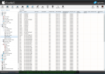
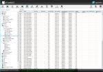
I wonder how the new UI will deal with having this many drives:

Capture1.PNG Capture2.PNG

That is 80 if I recall correctly, not counting the USB boot module.
The thing I want them to fix is having the Enclosure Slot column fill itself out. The information is available from sas2ircu.
For example da1 is in enclosure 2, sot 1; and da63 is in enclosure 5, slot 15.
The data is there and I can pull it up manually, but it isn't being populated in the table.
 
Top