The new UI is pretty, slick and visually refreshing. However, usability wise it is a downgrade in some areas and feels less responsive. Less information is displayed or takes more clicks to access. Items are tucked away into drop down menu requiring more clicks. Information sometimes uses too much empty space.
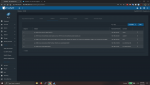
For example, the storage view.
https://i.imgur.com/cSOSF9p.png
Old UI a single click shows all the relevant information for each pool/datasets
https://i.imgur.com/ULFJsGW.png
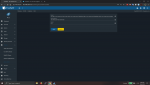
New UI a single click gives you this
https://i.imgur.com/NMv1Mot.png
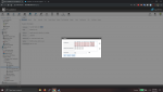
Takes 4 additional clicks to get same information as the old UI since everything is neatly collapsed. Maybe neat if it can remember the state it was last in. If you edit options of a dataset, everything is once again collapsed.