omcn7
Dabbler
- Joined
- May 19, 2015
- Messages
- 20
Greetings all,
As with the rest of you who are long time users of FreeNAS (now TrueNAS) I am finding the new UI a little tricky. It is - on the whole, a good change and I think it was time to make that step. I did do a search here on some terms to see if this has already been mentioned and I could just plus one to it. I was unable to find anything specific in the last couple years- since the new UI has been evolving.
My issue is with the collapsing menu layout. I use my monitors in a vertical layout aka landscape mode.
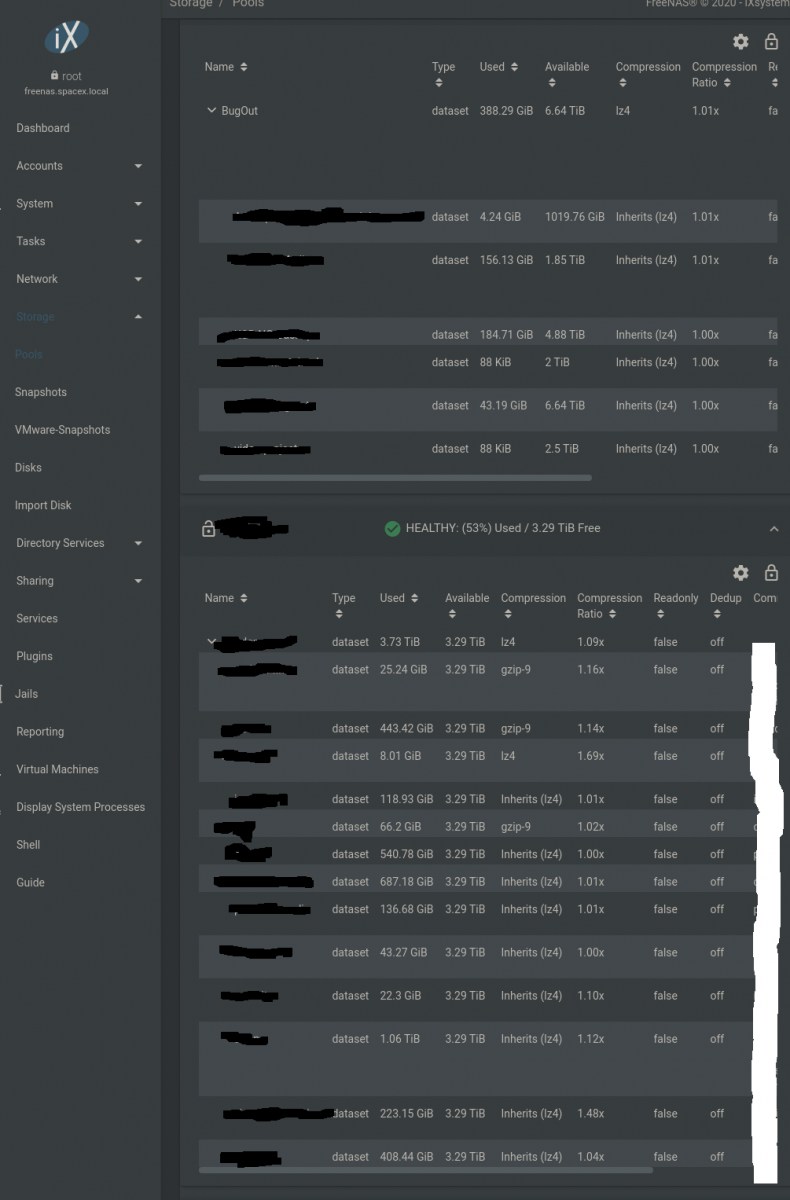
Here is a screenshot of what I see, and it applies to many UI menus for many functions. It's not a bug, it's just a design decision that I find - less functional.

As you can see here to make any changes I scroll to the right > then click the three dots to expand > then scroll back left (so I can see the dataset names) and scroll right again to expand.. rinse repeat. There has to be a better layout? I had the same issue in the normal horizontal monitor layout.
I do not have the window zoomed in. This is 1920x1080. I use Brave (aka Chromium) browser, latest version. The text size is medium, which is what is recommended.
I can't resize the side menu to make the datasets any wider, this is as narrow as it will go. This is full screen at full screen.
I have to say - it's a bad workflow. It is "pretty" which is of course subjective.
Would anyone else like to see this changed? Or am I just picky - or perhaps experiencing an issue you all are not having? I think the team has done a wonderful job here. I just would like to know if anyone else has this issue with a good number of the UI elements.
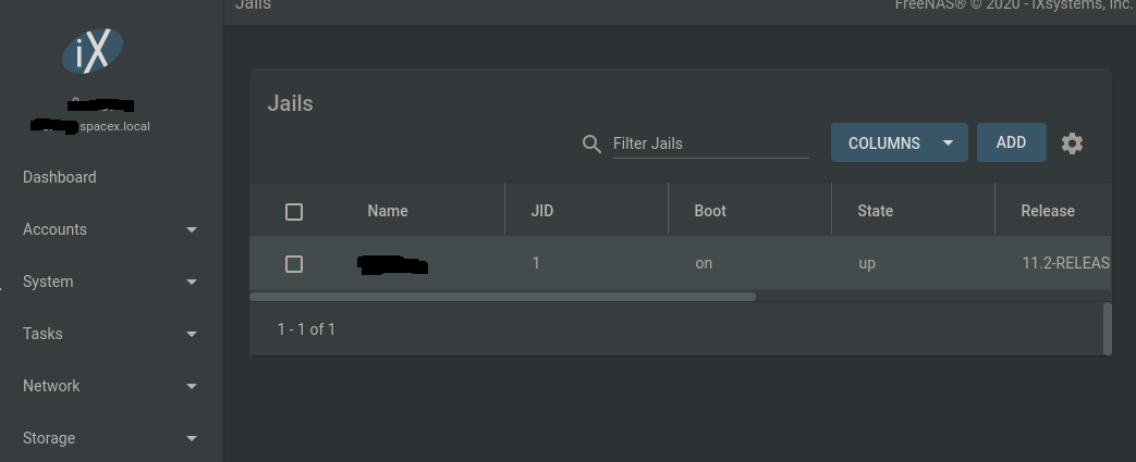
Here is a second example. There are several others menus with a similar issue.

Scroll right> dropdown menu > scroll left
In this picture I only have one row, but when you have additional rows, like in the first image. You see what I am getting at? -Cheers to the dev team. Keep it civil, but what do you all think of this?
As with the rest of you who are long time users of FreeNAS (now TrueNAS) I am finding the new UI a little tricky. It is - on the whole, a good change and I think it was time to make that step. I did do a search here on some terms to see if this has already been mentioned and I could just plus one to it. I was unable to find anything specific in the last couple years- since the new UI has been evolving.
My issue is with the collapsing menu layout. I use my monitors in a vertical layout aka landscape mode.
Here is a screenshot of what I see, and it applies to many UI menus for many functions. It's not a bug, it's just a design decision that I find - less functional.
As you can see here to make any changes I scroll to the right > then click the three dots to expand > then scroll back left (so I can see the dataset names) and scroll right again to expand.. rinse repeat. There has to be a better layout? I had the same issue in the normal horizontal monitor layout.
I do not have the window zoomed in. This is 1920x1080. I use Brave (aka Chromium) browser, latest version. The text size is medium, which is what is recommended.
I can't resize the side menu to make the datasets any wider, this is as narrow as it will go. This is full screen at full screen.
I have to say - it's a bad workflow. It is "pretty" which is of course subjective.
Would anyone else like to see this changed? Or am I just picky - or perhaps experiencing an issue you all are not having? I think the team has done a wonderful job here. I just would like to know if anyone else has this issue with a good number of the UI elements.
Here is a second example. There are several others menus with a similar issue.
Scroll right> dropdown menu > scroll left
In this picture I only have one row, but when you have additional rows, like in the first image. You see what I am getting at? -Cheers to the dev team. Keep it civil, but what do you all think of this?
