Brer
Explorer
- Joined
- Mar 2, 2017
- Messages
- 63
This is more of a feedback from personal experience than a test or dev post. I'm slowly getting the feel of the new GUI and it is beginning to look very sleek and professional and in some areas rivaling the old classic 9.10 GUI and I can definitely see potential.
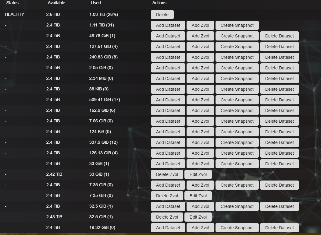
However, in parts I feel as though it is very cluttered with superfluous detail, buttons and then in busy screens hard to tell between multiple sections on the screen.
An example would be the Storage -> Volumes screen, I have given an example below, all the buttons are not really needed, over cluttering and spoiling the whole look and feel, wouldn't it be better to have a radio button selection or grid selection for each entry and then display the relevant buttons available, much like the 9.10 GUI does today. This may already be in the pipeline so sorry for jumping the gun.
The Service screen, while I like it, everything looks the same, would it be possible to maybe change the colour of stopped services? Maybe have each row highlight when you mouse over? More a personal preference than anything :)
As always, great job and all the hard work is really appreciated.
Thanks
