Predefined alert rules - Colour mismatch with graphic? Invisible rules?

Joined
Jan 4, 2014
Messages
1,644
Colour mismatch with graphic?

screenshot.448.png


When I look at the highlighted pre-defined alert rules above, my interpretation of this is that I'll see a cool blue colour if storage used is between 50 and 70 per cent, but I can expect to see a mauve colour if storage used is between 70 and 90 per cent.

For the latter condition, it's true. I can see that the (dimmed) alert message below is in mauve and this is also reflected in the storage graphic above it.

screenshot.450.png


However, for the former condition, I can see that the alert message below is blue, but shouldn't this also be reflected in the storage graphic above it? A blue informational alert and a corresponding pink graphic doesn't seem to make much sense to me.

screenshot.451.png


Invisible rules?

I suspect that there are some defaults applied. For instance, if storage is below 50%, the graphics are going to be blue anyway. Nevertheless, I do still like the idea of a (blue) informational alert between 50 and 70 per cent because it might be a forward indicator of an excessive rate of storage consumption.

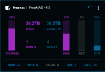
In the image below, the disk graphic is mauve, indicative of some increased disk activity. That's fine, but, where's the predefined rule for it? I don't see it in the Alert Rules table above. Should I? Shouldn't all colour changes be triggered by pre-defined alert rules? Or are the alert rules just for triggering alert messages and there are some other invisible pre-set rules in play for the graphics?

screenshot.446.png
 

Attachments

  • screenshot.446.png
    screenshot.446.png
    10.3 KB · Views: 229
Last edited:
Joined
Jan 4, 2014
Messages
1,644
@morganL @aervin Any thoughts on my ramblings here? Why I think this may be important can be summed up best by considering the following image:

screenshot.449.png


The only systems that are worthy of attention at this stage are freenas-l and freenas-r as both are starting to edge towards the infamous 80% full threshold. However, I've somewhat lost sight of that rich visual feedback from TC as the information has been camouflaged by systems will less pressing needs (freenas-b1 and freenas-b2). When you start considering dozens or hundreds of systems, that immediate and useful visual feedback then gets lost in the numbers.
 
Last edited:
Joined
Jan 4, 2014
Messages
1,644
Nevertheless, I do still like the idea of a (blue) informational alert between 50 and 70 per cent because it might be a forward indicator of an excessive rate of storage consumption.
I'm in two minds about this now. If the rate of consumption is important, then I think the action shown in the image below is preferable.

screenshot.468.png


Note that the storage graphic still remains blue, but Pools is flagged in red to draw attention to the rate of change.

There seems to be two overlapping approaches to flagging rate of consumption - the informational alert message described earlier and the visual action above. The latter, in my mind, is more informative, both visually and information-wise. The informational alert message now seems completely unnecessary to me, but what's curious is that if the rate of consumption is the motive for the alert, a message was sent rather than triggering the visual action above.
 
Last edited:

aervin

iXsystems
iXsystems
Joined
Jun 13, 2018
Messages
114
Hey @Basil Hendroff , I think the color-coded alert icons on the alert list page are causing the confusion. Built-in alert rules are not tied to the threshold logic on the dash. I'll make sure to remove those icon colors. I think we'd like to allow users to configure their own color thresholds for metrics, but we haven't even entered the design phase for such a feature, unfortunately.
 
Joined
Jan 4, 2014
Messages
1,644
I think there are a couple of issues here. Just putting the alert list page and built-in alert rules aside for the moment as this is masking the issue that I'm more interested in; consider the system tile for freenas-b2 in post #2. Storage is at 59%, but a warmer colour is being used to suggest that this system requires attention, when it does not. The dash logic has switched the colour for this graphic from blue to mauve at some threshold (which I haven't ascertained, but is likely to be around 50%) that may be too low.

Now, I understand from what you've just said, the alert rules are not tied to the threshold logic for the dash and this would be true for the DISK, NET and CPU graphics on a tile, but STORAGE is the odd-ball here. The designer responsible for the dash logic has decided on a change from a cool colour (system ok) to a warmer colour (warning!) at 50%(?) for the storage graphic, while the designer responsible for the storage alert rules has decided to change from a cool colour to a warmer colour at 70%. This is reflected by an information message (blue) changing to a warning message (mauve)

I'm suggesting that the threshold for the STORAGE dash logic is set too low. 70% is probably correct for a colour change if 80% is considered the threshold above which ZFS may have to work harder depending on how fragmented the remaining free space is.

Visually, when you consider the dashboard in post #2, there are some systems with phantom warnings alongside systems that do need attention. The ability to quickly identify systems that do need attention is lost because they're hidden among the systems with phantom warnings. While the designer for the storage alert rules has probably got the threshold right, for me, the storage alert messages are of less value (as they need to be interpreted and then processed cognitively) than the immediate visual feedback I get from colour changes on the dashboard triggered by dash logic. If thresholds for the dash logic are not set appropriately, it diminishes the value of that visual feedback.
 
Last edited:
Joined
Jan 4, 2014
Messages
1,644
@aervin You're welcome! I consider TrueCommand a really valuable tool for holistic system management.
 
Joined
Jan 4, 2014
Messages
1,644
Top