Archaniel
Explorer
- Joined
- Jun 9, 2016
- Messages
- 50
Hi gusy, I just tried the new UI beta and I must really say two things:
* wow, new design
* oh crap UX :(
* sooo many "details"
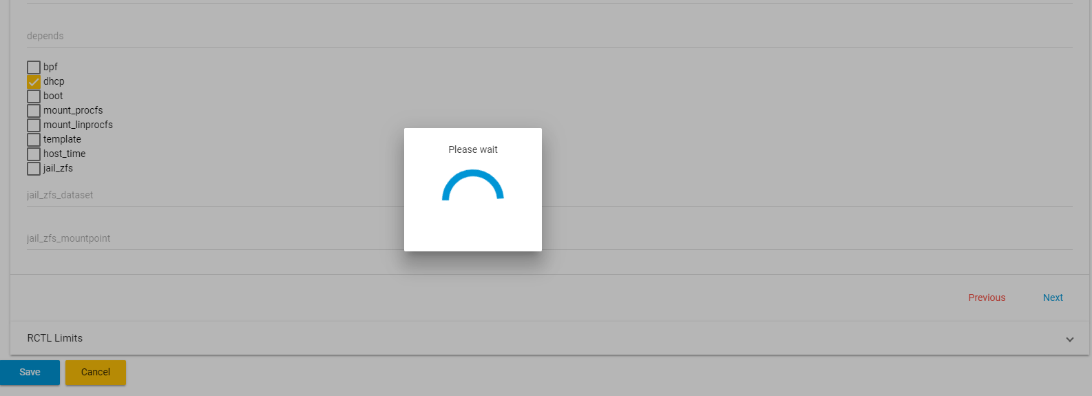
just a quick example the screenshot:

* What am I waiting for ... exactly?
* What is the system doing?
* What is the progress on it?
* What is the purpose of "Previous" and "Next" buttons? Haven't tried it, got scared.
* What is the jail_zfs_dataset for example? Why you didn't do a label, with a nice (i) tooltip explaining the functionality
* Why there is no padding, nor any UX hint that you can actually overwrite that jail_zfs_dataset etc
* What's the point of the icon in jails, which when you hover over just to get the simple PLUS button to add a jail? REALLY?
It's just one screen I was going over and I was in shock. There's no logic and seems like the designers are pure devs without any sense of UI design nor UX - that's BAD. If you are making something new, please make it properly :(
PS: While I was writing this, I'm still in "please wait" state ... no idea what for
* wow, new design
* oh crap UX :(
* sooo many "details"
just a quick example the screenshot:
* What am I waiting for ... exactly?
* What is the system doing?
* What is the progress on it?
* What is the purpose of "Previous" and "Next" buttons? Haven't tried it, got scared.
* What is the jail_zfs_dataset for example? Why you didn't do a label, with a nice (i) tooltip explaining the functionality
* Why there is no padding, nor any UX hint that you can actually overwrite that jail_zfs_dataset etc
* What's the point of the icon in jails, which when you hover over just to get the simple PLUS button to add a jail? REALLY?
It's just one screen I was going over and I was in shock. There's no logic and seems like the designers are pure devs without any sense of UI design nor UX - that's BAD. If you are making something new, please make it properly :(
PS: While I was writing this, I'm still in "please wait" state ... no idea what for
