



TrueNAS Development Documentation
This content follows experimental development changes in TrueNAS 28, a future version of TrueNAS.
Use the Product and Version selectors above to view content specific to a stable software release.
Dashboard Screen
13 minute read.
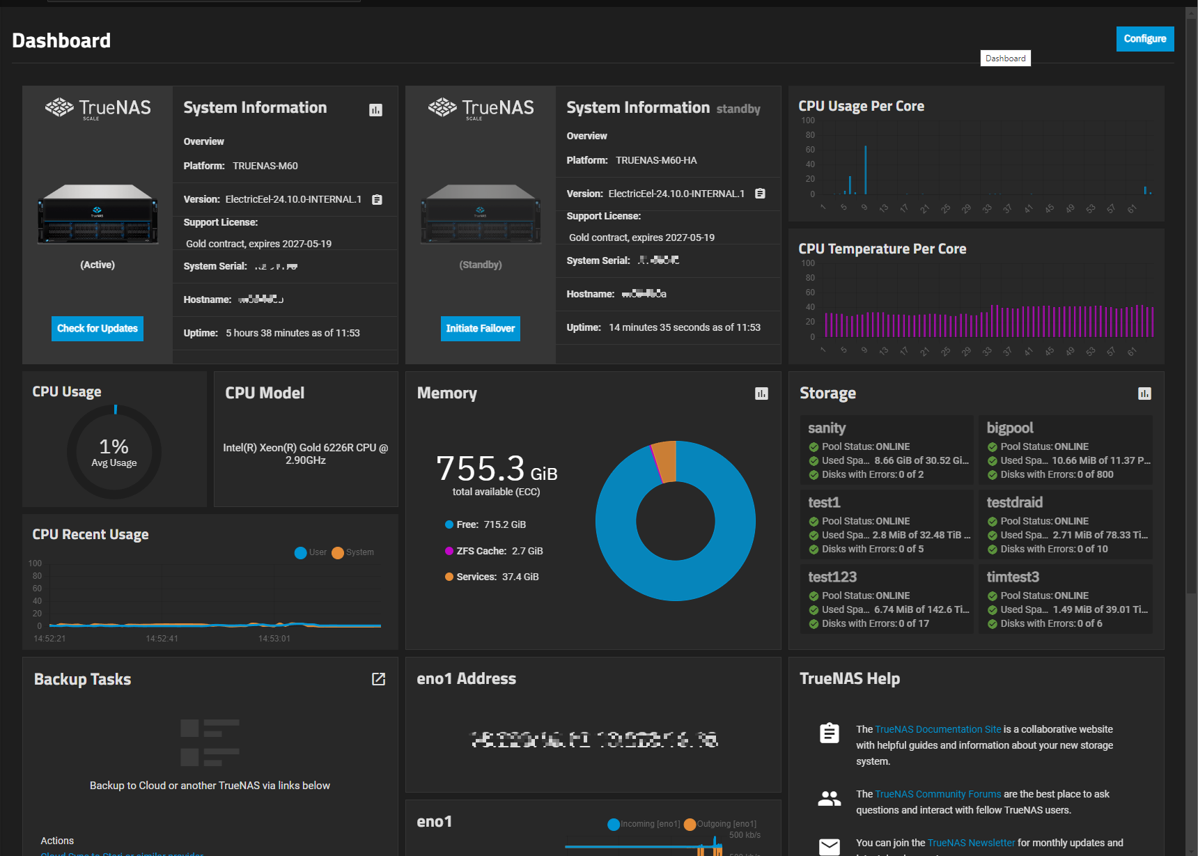
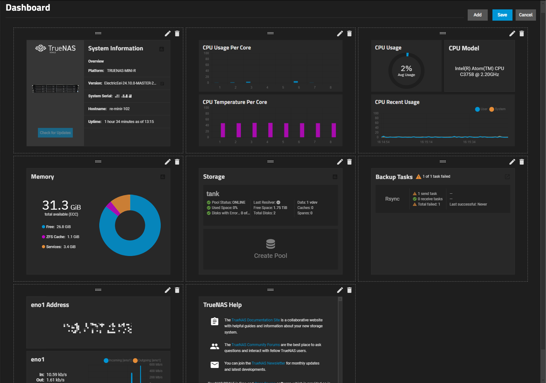
The Dashboard is the first screen you see after logging into the web interface after installing TrueNAS. It displays a set of default cards with system, help, storage, and network information, but you can customize the display to suit your needs and preferences. Dashboard on the left side navigation panel returns to the main dashboard from any other screen in the UI.
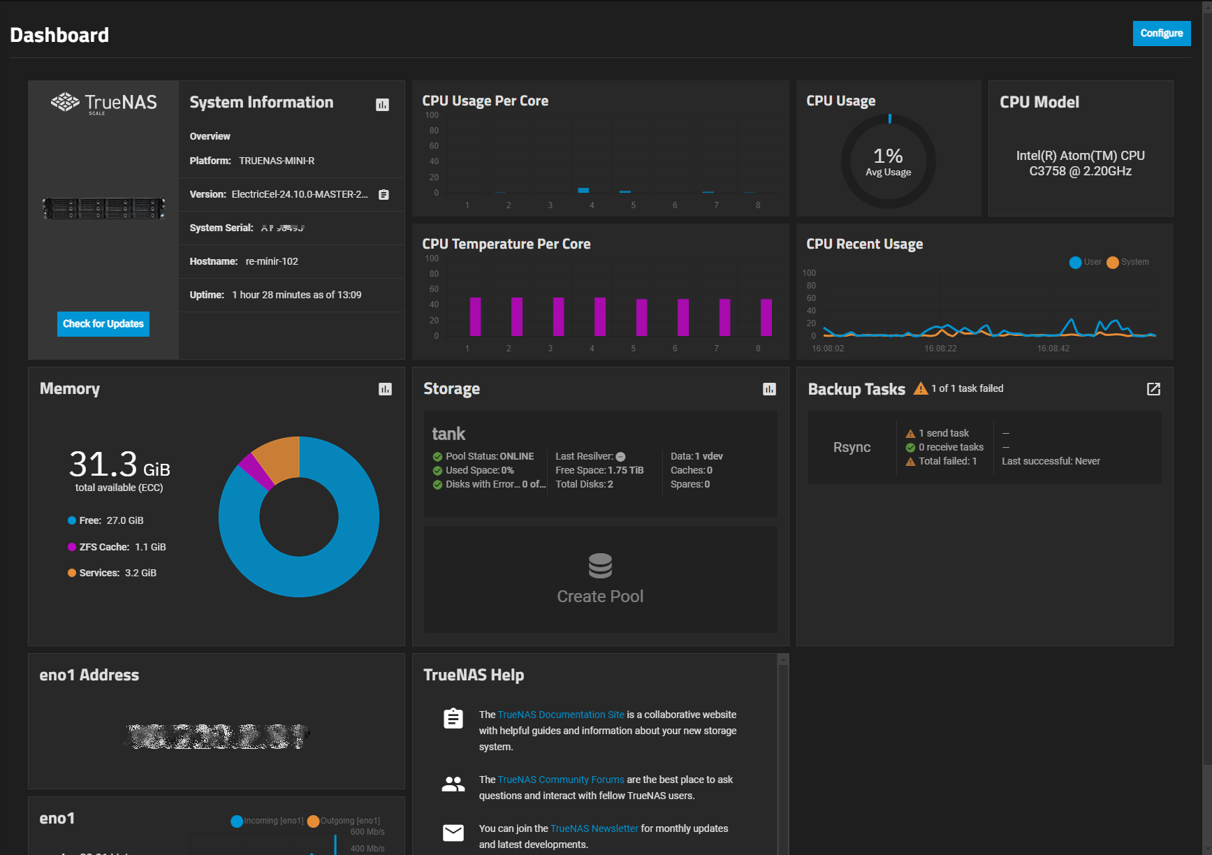
The Configure button at the top right of the Dashboard changes the screen to configuration mode and allows you to turn card displays on or off.
The Dashboard cards show information about the TrueNAS system basic settings, CPU and memory usage, network traffic and link status, storage, and backup tasks. Dashboard cards are customizable. Options include changing card layouts and the location on the screen and adding custom or application cards.
Pool and network interface cards vary based on system storage and network configurations.
Click on the Reports icon to display the data report screen that corresponds to the card category. For example, clicking the assessment icon on the CPU card opens the Reporting > CPU screen.
System Information Card
The System Information card shows general information about the TrueNAS system. The Updates Available button opens the System > Update screen.
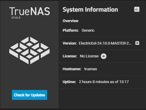
If installed on a customer-provided server, the card shows a generic TrueNAS image.
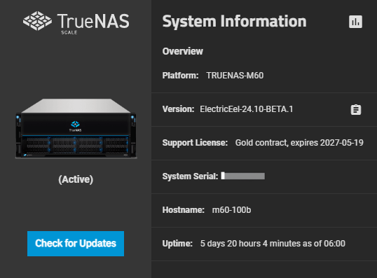
If installed on iXsystems-provided hardware, the card shows a picture of the system. Click on the image to display the View Enclosure screen.
| Field | Description |
|---|---|
| Platform | Shows as Generic for customer-provided server and hardware and displays the TrueNAS logo to the left of the System Information fields. The TrueNAS model number for the iXsystems-provided server and hardware and a picture of the server shows in the area to the left of the fields. |
| Version | Shows the currently installed software release of TrueNAS. Use the clipboard icon to display the full name of the release installed and to copy the version to the clipboard. |
| Edition | Shows the edition of the currently installed software release of TrueNAS. |
| Uptime | Shows the number of consecutive days, hours, and minutes of system runtime since the last restart. |
| Updates Available Check for Updates | Opens the System Update screen, or go to System > Update on the left-side main menu panel to open the System Update screen. Updates Available shows when systems updates are available for the current system release train. |
| System Serial | Shows the unique serial number of the attached TrueNAS system. |
HA System Information Cards
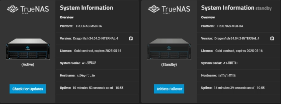
The two HA Active and Standby controller System Information cards show only for systems licensed for HA.
Each HA active or standby System Information card shows the same information found on the non-HA System Information card but also shows the system serial number, system license number, and type. The standby controller card shows the Initiate Failover button. The active controller card shows the Check for Updates button.
CPU Card
The CPU cards show the CPU model, dynamic gauges, and graphs of CPU usage and recent usage, and CPU usage and temperature per system core. All values are updated in real time.
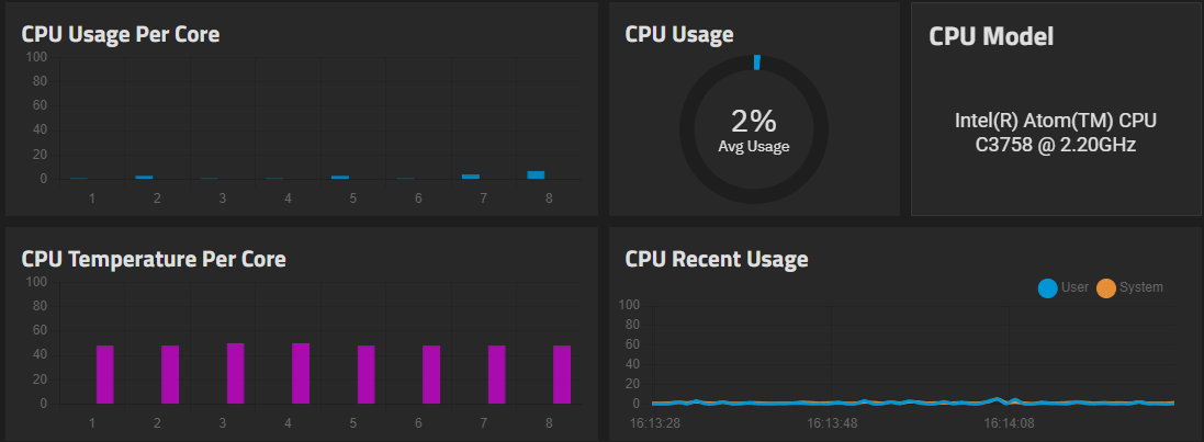
The card shows gauges and graphs showing CPU statistics:
- CPU Model card shows the CPU model.
- CPU Usage gauge shows the average percent of usage for the CPU cores.
- CPU Recent Usage gauge that shows recent CPU usage updated in realtime, and includes the CPU model number, number of cores, and physical cores.
- CPU Usage per Core bar graph that shows CPU usage per core.
- CPU Temperature per Core bar graph that shows CPU Usage in blue and Temperature in orange.
- CPU Recent Temperature gauge that shows recent CPU temperatures updated in real time.
- CPU Overview card shows the CPU model, number of cores, number of threads, highest usage percentage, hottest measured temperature, CPU average usage gauge, and bar graph of CPU usage per core.
- CPU Temp card shows the current temperature of the system CPU.
Memory Card
The Memory card shows current system memory consumption information.
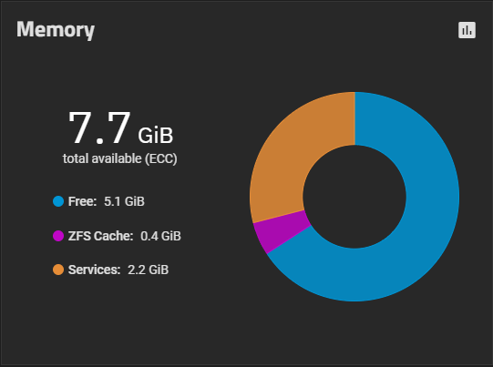
The card includes a gauge showing GiB Free in blue, ZFS Cache in fuchsia pink, and Services in orange.
You can configure the memory card as one large (100%) or one long (50%) plus two quarter-size (25%) card layouts.
Network and Interface Cards
The Network card shows two cards, one with a dynamic bar graph showing the time of recorded traffic and the incoming (blue) and outgoing (orange) traffic in kbs, and the status of the configured primary system interface(s), link status, network I/O traffic, and media type and subtype if known, and the other shows the primary interface IP address.
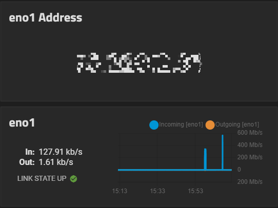
For systems with multiple interfaces, switch the card to the Interface card and set each to the interfaces on your system. An Interface card shows traffic, link status, interface media type and subtype, and any VLANS and the IP Address and port number.
Storage and Pool Cards
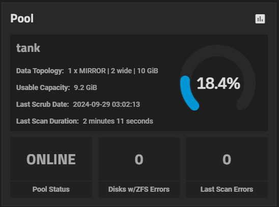
The Storage card shows the primary (root) pool status, path, and number of VDEVs configured in that pool. It also shows the percentage of used and free space and any caches. It reports the number of disks with errors, the total number of disks in the pool, and if a spare exists.
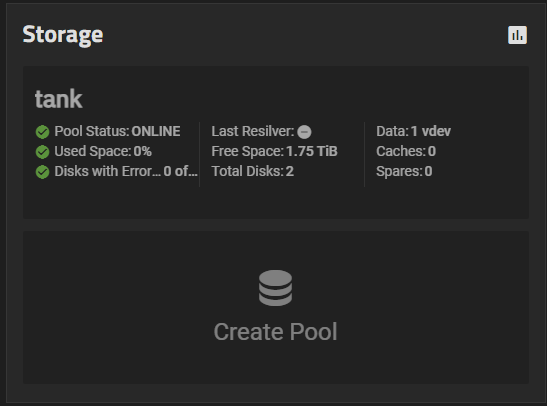
The Storage card includes the Create Pool card that when clicked, opens the Pool Creation Wizard screen. You can configure individual pool cards that show the same information as the root pool in the Storage card.
Backup Tasks Card
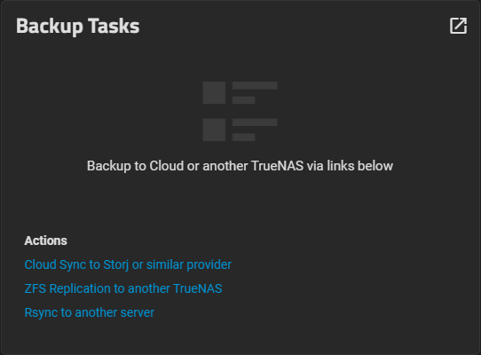
The Backup Task card shows links to quickly set up an automated data backup schedule if a backup task does not exist. Click open_in_new to open the Data Protection screen with all options for checking or backing up stored data.
When a backup task exists, the card shows details about the various backup tasks configured on the system.
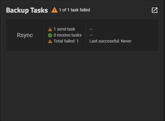
The card shows the number of tasks for each type of backup, the direction of data (sent or received), the number of times tasks failed and succeeded, and weekly success counters.
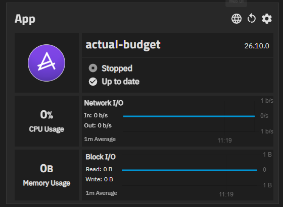
The TrueNAS Help card shows links to various TrueNAS websites. Links included are: Click on each link to open it in a new browser tab. App cards show the status and resource usage of one installed app.
You add an app card to the Dashboard for each app you want to monitor. The full-size Application card shows: The header of each app card includes icon buttons that control the app.
Hover over a button to show its tooltip.Help Card
App Cards
Button Description Web UI Opens the main web portal for the app in a new browser tab. The tooltip shows the name of the portal. The card uses the portal with Web UI in its name as the main portal. If the app has no portal with that name, the card uses the first portal listed for the app. If the app does not have a web portal, this button does not show. TrueNAS replaces an address of 0.0.0.0 in the portal URL with the host name or IP address you use to access the TrueNAS web interface. Other Portals Opens a list of the other portals for the app. Selecting a portal name opens that portal in a new browser tab. Shows only for apps with more than one web portal. Restart App Restarts the app and shows the Restarting App progress dialog. The button is not available while the app state is Deploying. Check App Details Opens the Installed apps screen with the details for the app.

In configuration mode, dashboard cards are enclosed in dotted-line boxes to show the area for each card.
Add opens a blank Card Editor screen.
Save saves all changes made to the dashboard.
Cancel closes configuration mode without saving any changes. Changes made and saved on the Card Editor screen are discarded if you click Cancel.
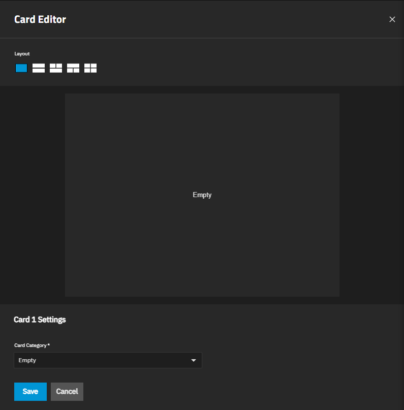
Add opens a blank Card Editor.
Save saves any changes and exits configuration mode. Cancel exits configuration mode without saving changes.
Pressing Esc (escape) also exits configuration mode and discards any changes made to card configurations or placements.
Each card area uses one of five layouts. A layout holds one to four cards of different sizes and configurations. Layout options show on the Card Editor screen.
Each card shows three function icons:
Drag handle that allows you to grab and move the card to a new location on the screen. Dragging a card to a new location shifts the other cards one position to the left or right depending on where the dragged card is placed.
Edit opens the Card Editor populated with the settings for the existing card.
Delete removes the card from the Dashboard.
Pressing Tab allows selecting the next button or function icon on the screen and across all cards.
Access to the Card Editor screen is available when the Dashboard screen is in configuration mode. The edit icon for any card opens the Card Editor populated with the current settings for that card. Add opens the Card Editor with no settings.
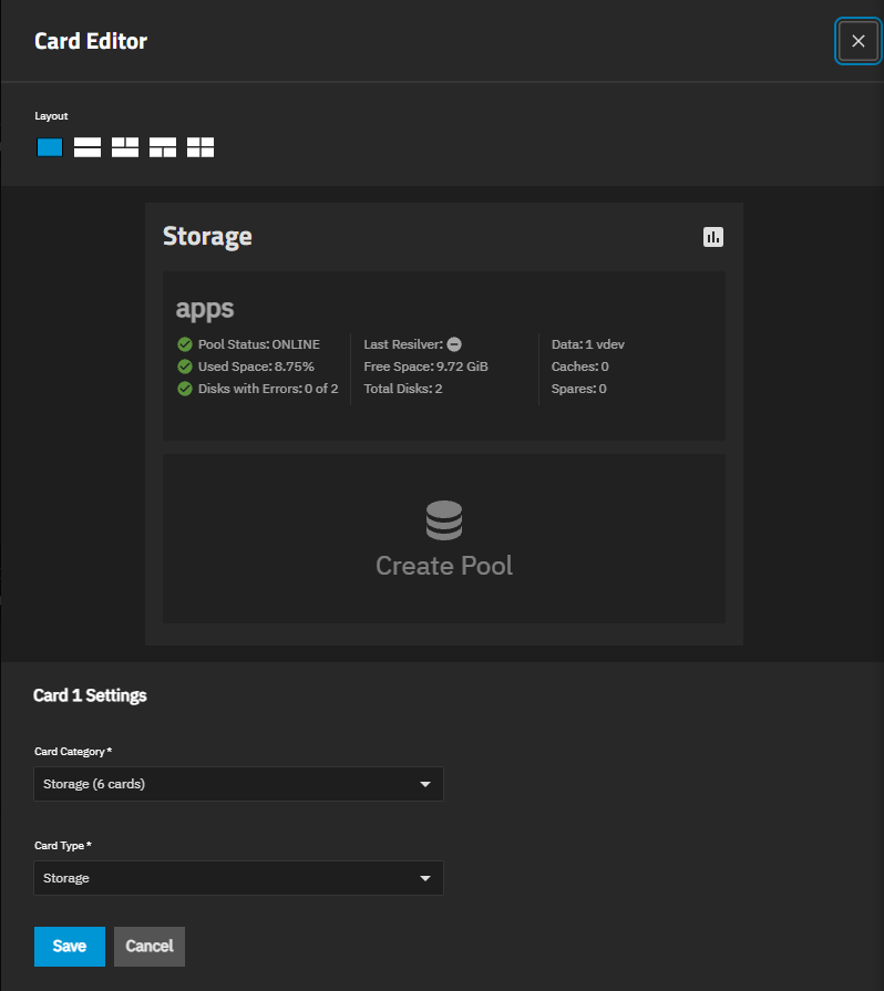
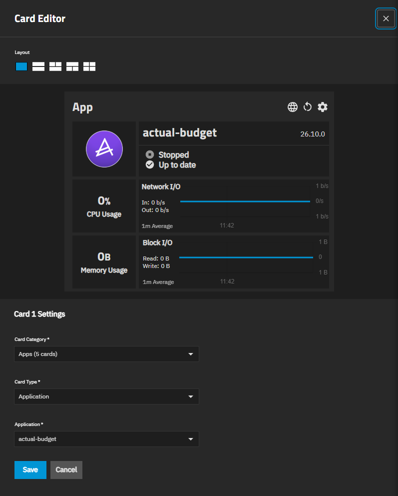
Select an individual card in a layout with multiple cards to change the category and type and customize the display of the card. The editor shows a preview of the layout and a settings section for the selected card, such as Card 1 Settings.
| Setting | Description |
|---|---|
| Layouts | Sets the layout of the cards in the group. Clicking on a layout image add one to four cards in the group. Not all card categories support all layouts. |
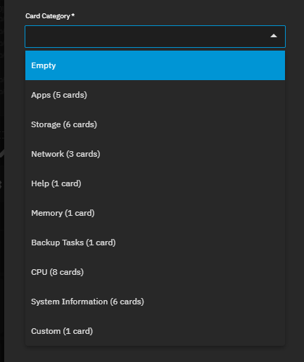
| Card Category | Sets the information category to the dropdown list option selected. Each option shows the number of card types it includes, for example, Apps (5 cards):
|
| Card Type | Sets the type of information shown in the selected card. Options change based on the selected Card Category. See Card Type Options by Category for information on the options by the category and type selected. |
The System Information card has six Card Type options, Hostname-Active, OS Version, Serial-Active, and System Image, System Information-Active, and System Uptime.
HA systems, with two controllers and an HA license, show the Hostname-Standby, Serial-Standby, and System Information-Standby card types. The dashboard in larger systems with hundreds of drives have a slower response when populating the screen cards in normal and configuration mode.
Be patient and wait until your system is fully online before attempting to customize dashboard cards. HA-licensed system dashboards show the active and standby controller cards in a full-size card. The System Information card displays the following Card Type options: Hostname - Active, Hostname - Passive, OS Version, Serial - Active, Serial - Passive, System Image, System Information - Active, System Information - Standby, and System Uptime. OS Version, System Uptime, or System Image can use a full, half, or quarter-size card.
These can be included in a layout with other card categories and types to create a mixed information card. There are five card types available when Card Category is set to Apps.
Selecting any of these types adds the required Application field to the screen. Select the installed app to show in the card from the dropdown list. Every app card type includes the control buttons described in the App Cards section. If you uninstall (delete) the app shown in an app card, the dashboard does not remove the card.
Edit the card to select a different app, or delete the card.Card Type Options for System Information
TrueNAS EnterpriseCard Type Options for Apps
Card Type Size Description Application Full Shows the app logo, name, version, state, update status, CPU usage, memory usage, network I/O, and block I/O. Application Information Half Shows the app logo, name, version, state, and update status. Application Network Half Shows the app logo and network I/O traffic. Application CPU Usage Quarter Shows the CPU usage of the app as a percentage. Application Memory Quarter Shows the memory usage of the app.